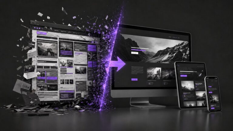
Un visitante tarda menos de 3 segundos en decidir si se queda en tu web o se va. En ese instante no está leyendo tu propuesta de valor con calma: está reaccionando a una impresión visual. Por eso, cada vez que nos sentamos a rediseñar un sitio en Pixie Labs, repetimos la misma idea: el diseño UI/UX no es “hacerlo lindo”, es una herramienta de negocio que decide, literalmente, cuánto vendés.
Lo primero que miramos siempre es la jerarquía visual. Si todo en la página grita al mismo tiempo —títulos grandes, botones de colores, textos en negrita por todos lados— el visitante no sabe hacia dónde mirar primero. Una buena jerarquía guía el ojo: primero lo más importante, después lo secundario. Menos elementos compitiendo entre sí significa más claridad, y más claridad significa más conversión.
Algo parecido pasa con los llamados a la acción. “Comprar ahora”, “Agendar una llamada”, “Descargar la guía”: si tu página ofrece cinco acciones distintas al mismo tiempo, es probable que el visitante no tome ninguna. Definir una acción principal por sección, y hacerla visualmente evidente, mejora la conversión de forma directa y medible, y es de las primeras cosas que ajustamos cuando revisamos un sitio.
Después está la velocidad de carga, que muchas veces no se piensa como parte del diseño pero lo es. El diseño más lindo del mundo no sirve de nada si tarda seis segundos en cargar. Cada segundo extra aumenta la probabilidad de que el visitante se vaya antes de ver tu contenido, así que imágenes optimizadas y un hosting adecuado terminan siendo, en la práctica, parte de la experiencia de usuario.
Con los formularios pasa algo similar: cada campo adicional es una excusa más para abandonarlo. Nosotros solemos pedir solo lo estrictamente necesario para el primer contacto —nombre, email, y quizás un dato más— y dejamos el resto de la información para una conversación posterior. Un formulario de tres campos convierte sensiblemente mejor que uno de diez, y la diferencia se nota rápido en los números.
Y por último, algo que asumimos como punto de partida en cualquier proyecto nuevo: diseñar mobile-first, no mobile-adaptado. La mayoría de tus visitantes probablemente entra desde el celular, y pensar primero en esa pantalla chica —en vez de simplemente “achicar” el diseño de escritorio— cambia por completo qué tan fácil es navegar, leer y completar una acción desde el teléfono.
To see it in action
Un buen repaso visual de cómo el diseño y el contenido impactan en la conversión:
Cada uno de estos puntos es una decisión de diseño concreta, no una cuestión de gusto estético. Revisar tu sitio actual con esta mirada puede darte una idea rápida de dónde estás perdiendo conversiones. En Pixie Labs trabajamos el diseño UI/UX pensando siempre en ese objetivo: que la experiencia visual acompañe, y no entorpezca, el resultado de negocio que buscás.